
From Formula to Form: A Conversation with Mathilda Florentine
Our logo is more than just a symbol; it's a visual interpretation of our formula first approach and a tribute to the care that defines every product.
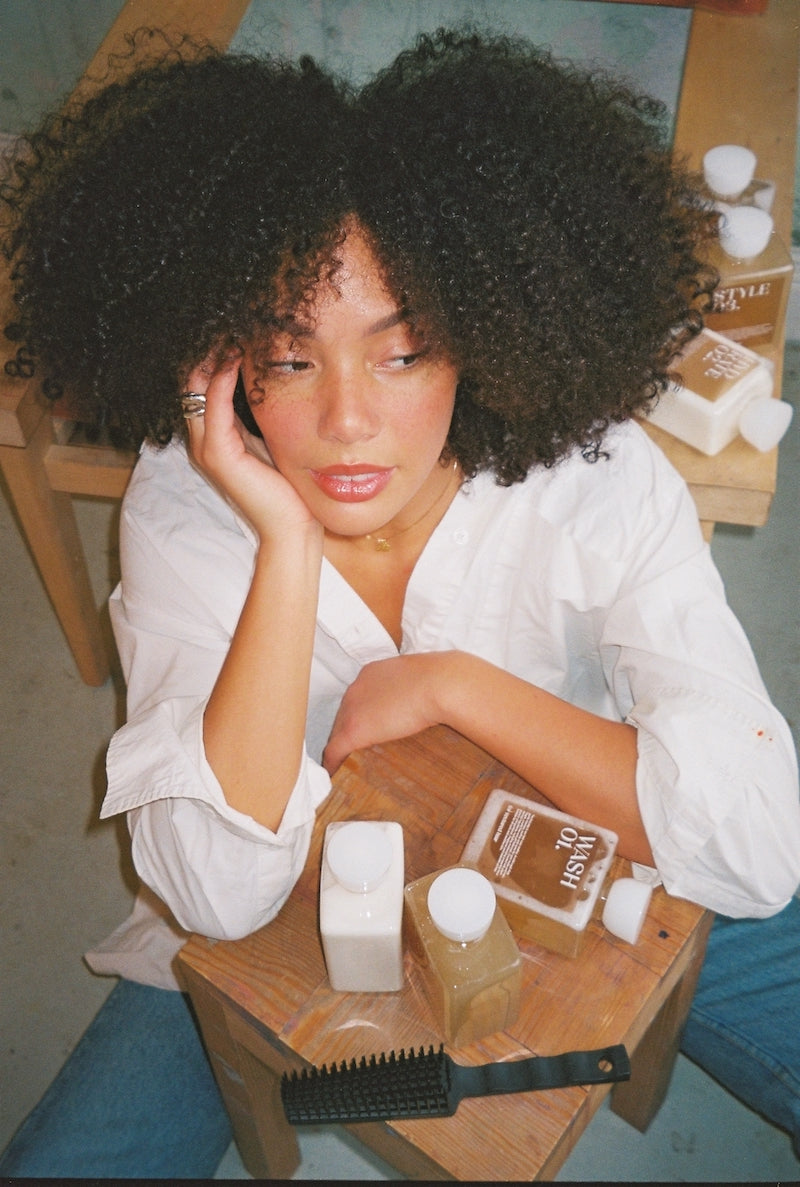
When we launched FTH, our focus was clear: to develop a formula that prioritizes sustainability, efficacy, and long-term care for textured hair. Therefore, the design of our logo had to wait. When the time was right, it wouldn't just label our bottles; it would carry our message.
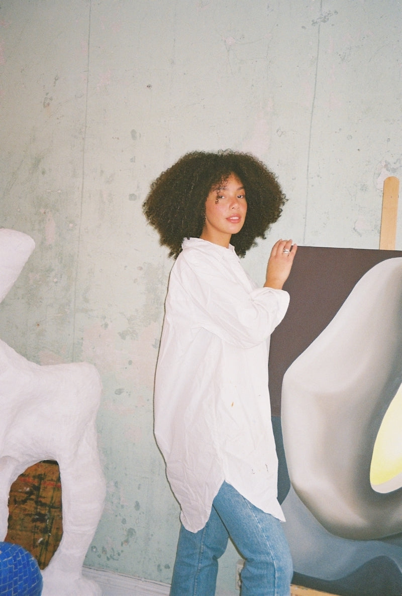
Mathilda Florentine helped us put the final piece of the puzzle in place. As an artist and sculptor with an organic and abstract design language, she translated the essence of our formula into a visual identity. The result? A logo that feels as authentic, versatile, and natural as the community we created it for.
In this interview, Mathilda shares her creative process, from reference libraries to sketchbooks. An insight into how art and function meet, and how FTH's visual identity took shape.
FTH | What does your creative process usually look like, and how did FTH's formula inspire the logo design?
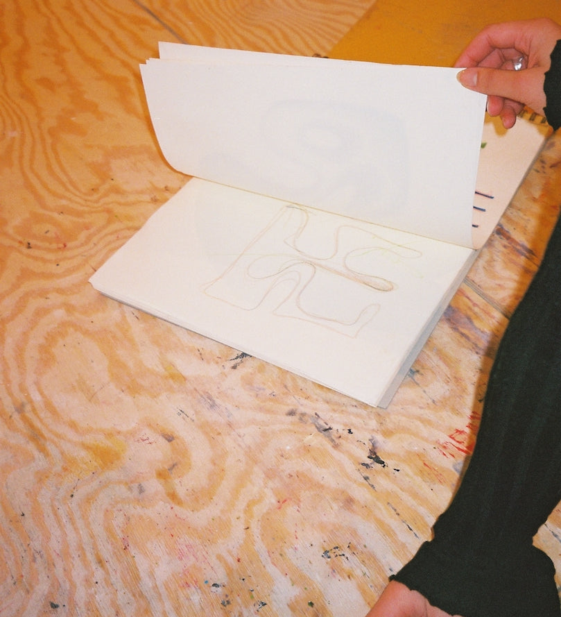
MATHILDA | I always start by building a library of collected references and inspiration. It can be anything and everything, but it helps me build the world I then create within. In FTH's case, it was a mix of the organic nature of the formula, the simplicity of the routine, and the elegance and uniqueness of textured hair. Then I analyze the needs and how the logo will be used and sketch out proposals that can then be tested and discussed.
FTH | You're not just the woman behind our logo, you're also an artist. Where do you find your inspiration when creating your art?
MATHILDA | I can feel inspired by almost anything. For me, it's more about getting into the right state of mind to create. Art is a way for me to relax, vent, and process things.
FTH | What role did your background as an artist and sculptor play in the creation of this design?
MATHILDA | The logo's design is very much in line with my artistic style, which made the work inspiring because I was able to incorporate my artistry into the process. I believe this allowed the logo to become more abstract and organic.
FTH | Do you have any favorite motifs that you revisit in your artistic work?
MATHILDA | Almost all the motifs in my paintings are close-ups, angles, or parts of my sculptures. Otherwise, much of what I create consists of abstract interpretations of everyday objects.
"I wanted the logo to have a clear identity and not look like anything else on the market, but the most important thing was for the logo to look the way the formula feels, because in this case, the product is everything."
FTH | How do you balance creating something aesthetically pleasing and ensuring the logo is also practical?
MATHILDA | I usually start with the creative aspect and develop a few different options based on the client's wishes. Then I proceed to test them in all the different ways the logo will be used and adjust accordingly.
FTH | Which feeling or message was most important for you for the final result to convey?
MATHILDA | I wanted the logo to have a clear identity and not look like anything else on the market, but the most important thing was for the logo to look the way the formula feels, because the product in this case is everything.
